( Challenge )
Okis is a service and product brand that specializes in eyebrow shaping. The company’s main function in professional training, developing products for eyebrows, as well as eyebrow services in their own salons. During the launch stage, the brand needed to formulate a grand idea that is able to unite all of their directions, establish their positioning, distinctive features, and the culture of Okis, and additionally create a visual and verbal strategy for this relative newcomer.


( Strategy )
The main challenge of the brand was transforming the irreverent attitude people had towards the profession, the brand needed a design that would demonstrate that they are serious about their industry and that’s not simply just a hobby. Answering to the challenge the big idea of the brand — Browfessional. Brand tone is intentionally serious and corporate, the same messages are conveyed through the all brand’s visual system, reflecting the honest and authentic values of the company.


( Design )
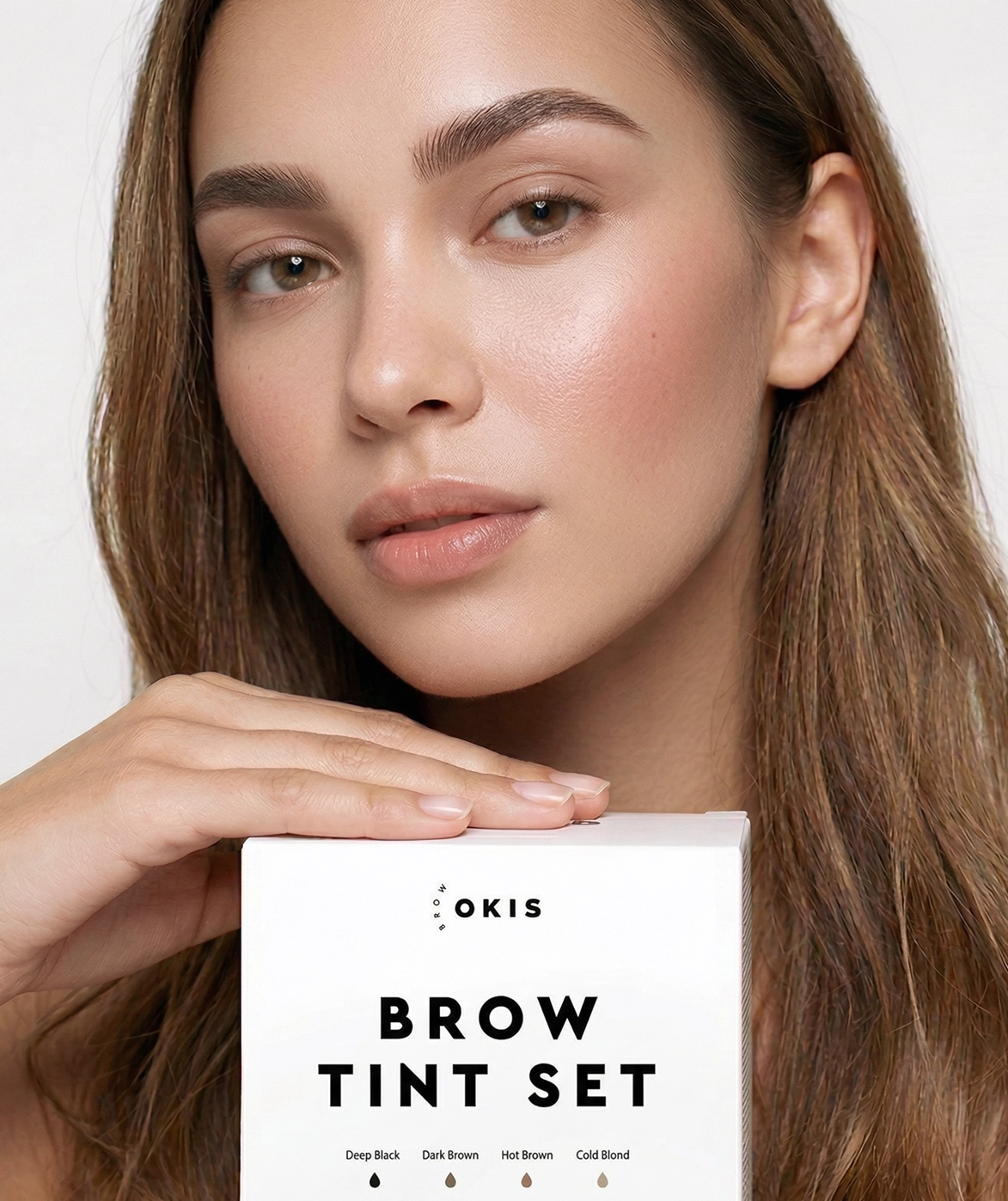
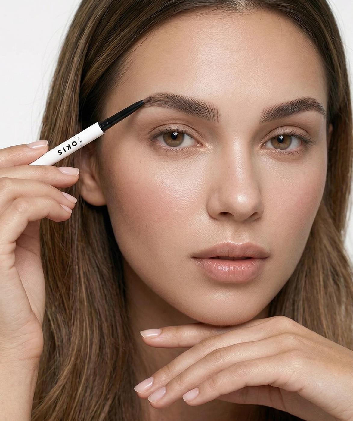
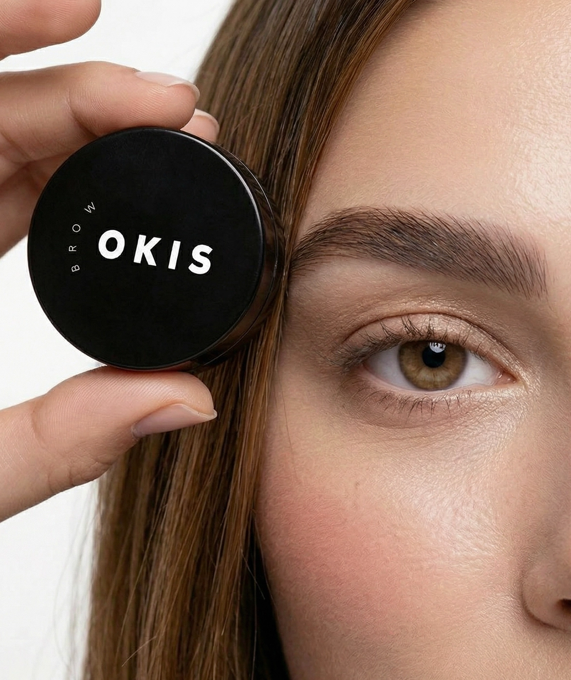
The brand system utilises black typography, coupled with open white-space that cultivates a minimalist and modern aesthetic which allows product and content to take center stage. Additionally, the brand utilises an optimistic and purposeful tone of voice that reflects the spirit of a company that is always looking to innovate with grace and purpose.


( Result )
The visual identity is based on a clean and simple system which works well on a large assortment of formats, including labels, packaging, promo materials and other brand expressions. The look and feel of the new brand is understated and straightforward, emphasising the authenticity of Okis’ high-quality products


